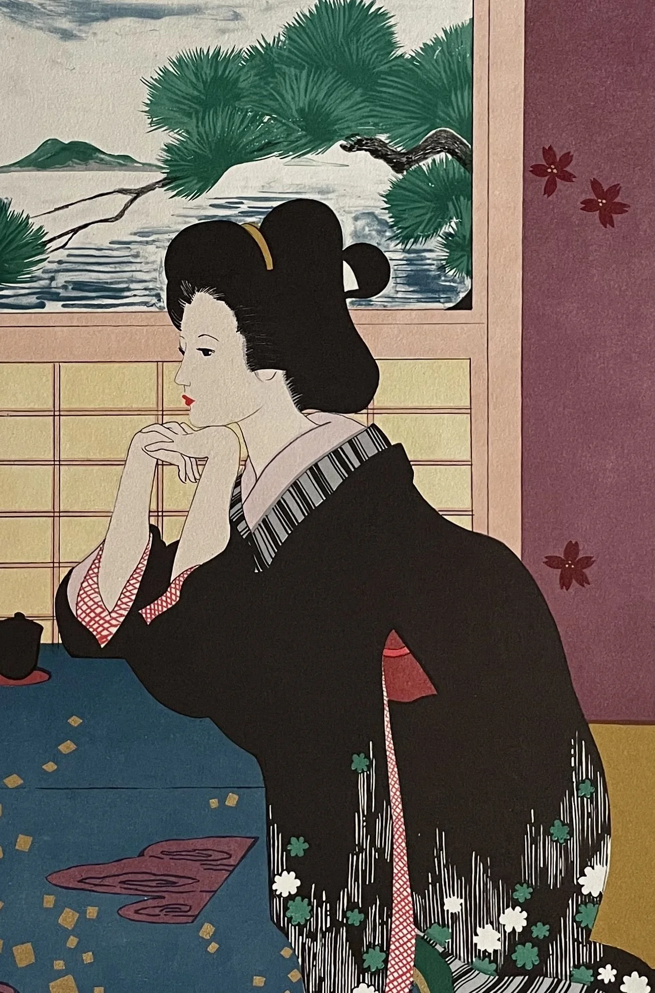
Image 1 of 5
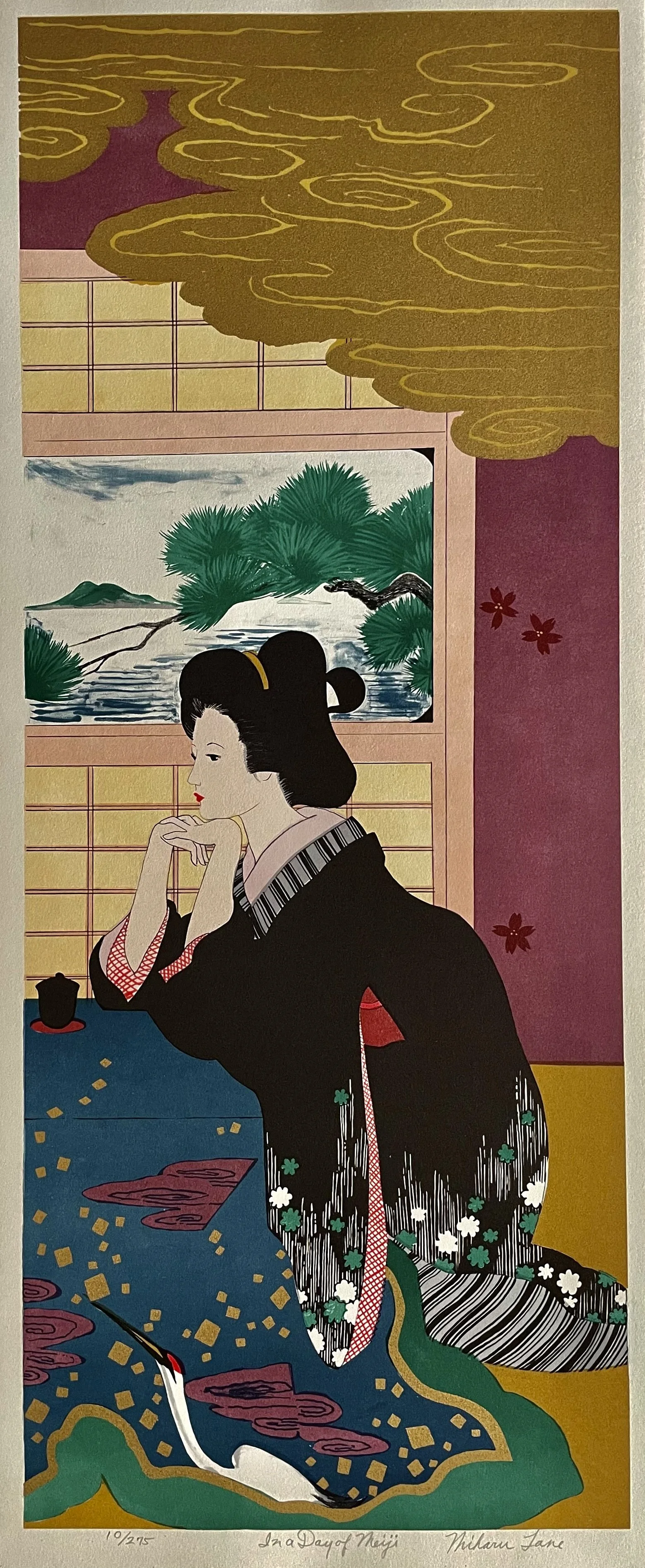
 Image 2 of 5
 Image 3 of 5
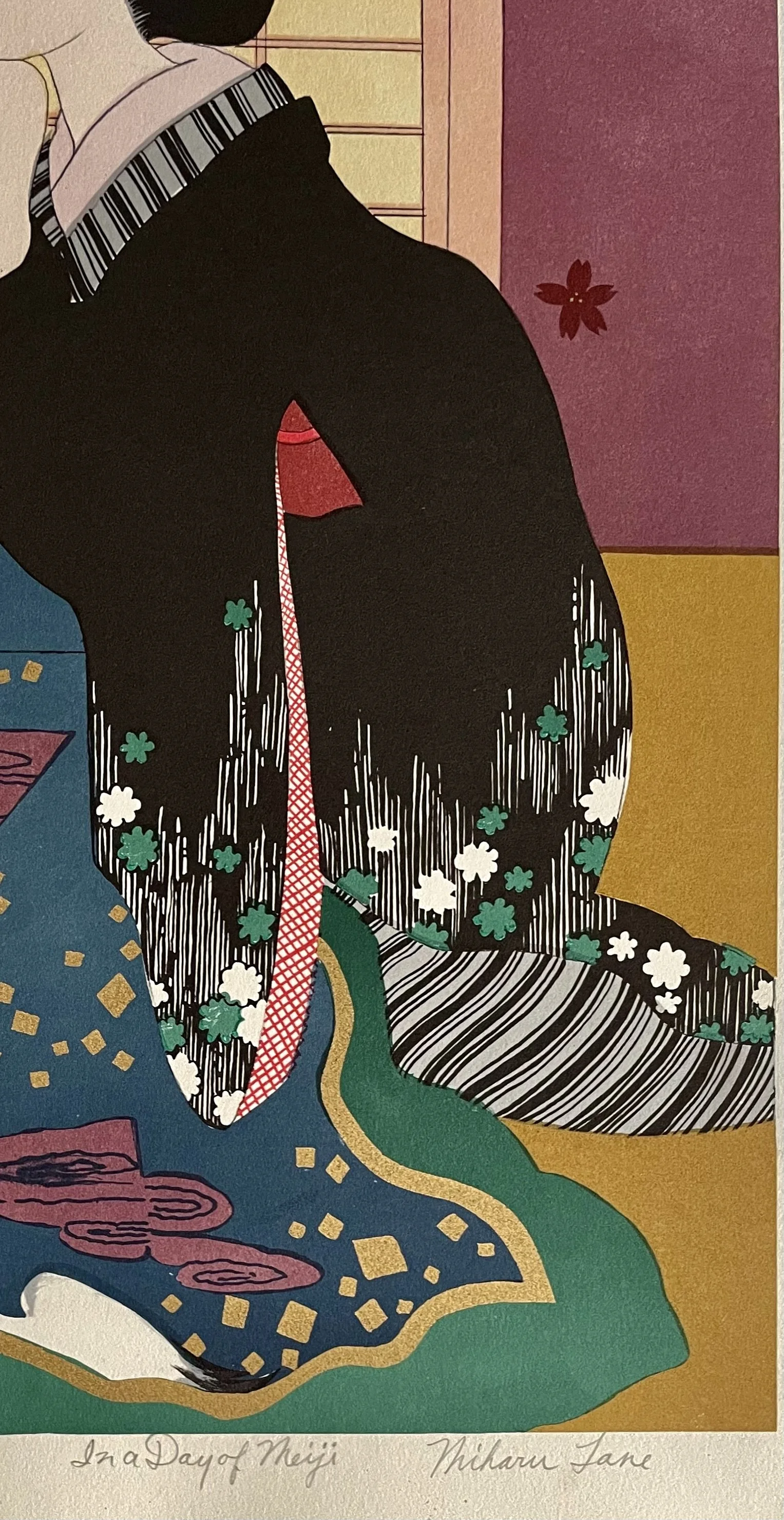
 Image 4 of 5
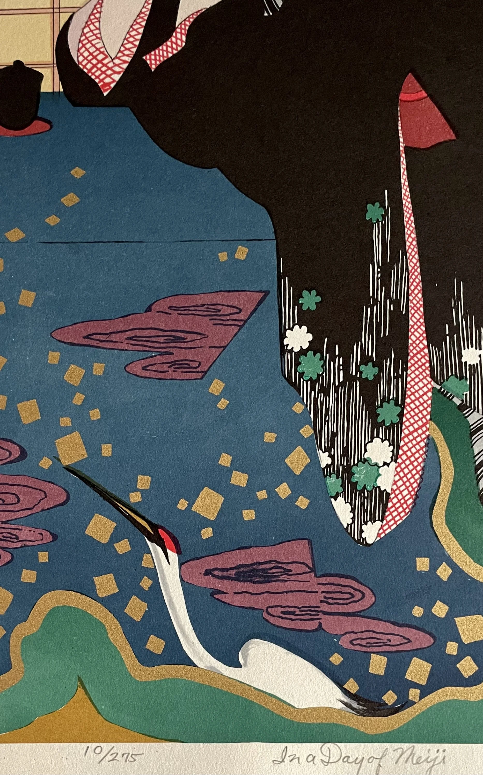
 Image 5 of 5
“CUBES IN LINE”-
MARKO SPALATIN - Serigraph - Signed & Numbered - 12/50
Image 25-1/2 x 20 inches (including signature and narrow white margin), paper 30-1/2 x 25-1/2 inches. LIMITED EDITION HAND PULLED & DRAWN ORIGINAL SERIGRAPH, NUMBERED & HAND SIGNED BY ARTIST. From the retired Mitch Moore Gallery Inc, NYC. Unmatted, never framed or displayed. Image area is in very good frameable vintage condition.
ARTISTS BIO: Marko Spalatin: Born in 1945 in Zagreb, Croatia, Marko Spalatin immigrated to the United States in 1963. He studied at the University of Wisconsin at Madison, and earned a B.S. in Art in 1968 and a M.F.A. in 1971. He is well known for his colorful geometric designs in the form of limited edition prints and also original paintings. The movement of light through the world and across variegated surfaces and the relationship between them, is one of the focal points of Spalatin's work. Although the paintings are inspired by nature, the specific source is finally not what is important. Spalatin's painting may inspire the viewer to recall the shifting brilliance of sunlight on summer's leaves, the swaying movements of a school of brightly colored tropical fish, the glittering reflections of moonlight on the ocean, or some other dazzling occurrence in nature. However, the viewer's task is not to figure out where a painting comes from, the to experience what it is. His work is displayed in major museums around the world. Read more about the artist and see a sampling of his other works on his website. Search on Marko Spalatin.
ARTIST'S STATEMENT: "My work represents a continuous involvement with abstract geometric forms defined by careful manipulation of color and light. The relationship between form and color within the pictorial field demands a visually symbiotic presence. The challenge revolves around the selection of a form as a vehicle for color, as well as choosing appropriate color and light for that form. This interplay creates a primary spatial illusion, along with secondary effects. I find that precisely defined areas of color, when placed against each other, compete for dominance. This activity, when further accentuated by tonal structure, produces multiple levels of perception. A given area of uniformly applied pigment loses its flat character through simultaneous contract with the surrounding colors. In many cases, the positive and negative spaces within the field become interchangeable. In more complex paintings, when the substructure is a series of repetitive modules, the color-light interplay reveals its polyphonic character. In general, my compositions remain formal and symmetrical in order to be set in motion by unexpected mutations of color and light. In some cases, the careful placement of small areas of saturated color against a backdrop of transitional grays creates an illusion of suspended particles. There is no doubt that in these images in particular, my sense of color and light is subconsciously influenced and sustained by many years of scuba diving in the waters of the Adriatic Sea and the Caribbean. I am intrigued by the relativity of color and by the mystery of light, and I am constantly challenged to explore their potentials. Every painting becomes a self-imposed visual problem, subjectively resolved in search of an objective truth."
His prints and paintings have been featured in over 70 solo exhibitions across the US, as well as in France, Croatia, Canada, Lebanon, Italy, and Slovenia, and in numerous group exhibitions in 12 countries. Spalatin’s work is represented in many private, corporate, and public collections, including:
COMMISSIONS AND PERMANENT COLLECTIONS
Museum of Modern Art, New York, NY
Musee d'Art Modern, Paris
Tate Gallery, London
Victoria and Albert Museum, London
Philadelphia Museum of Art, Philadelphia, PA
New York Public Library, New York City
Library of Congress, Washington, D.C.
Brooklyn Museum, Brooklyn, N.Y.
Akron Art Institute, Akron, Ohio
Oklahoma Art Center, Oklahoma City, Oklahoma
U.S. Steel Collection, Pittsburgh, PA
Pittsburgh National Bank, Pittsburgh, PA
Wisconsin Art Foundation
International Graphic Art Society, New York
American National Insurance Company, Galveston, Texas
Chase Manhattan Bank
Lessing J. Rosenwald Collection, Philadelphia, PA
Bibliotheque National, Paris, France
Museum of Contemporary Art-Chicago, Illinois
Metropolitan Museum-Manila, Philippines
Philadelphia Museum of Art-Philadelphia, Pennsylvania
The Butler Institute of American Art-Youngstown, Ohio
Museum of Modern Art-Belgrade, Yugoslavia
Milwaukee Art Museum-Milwaukee, Wisconsin
Lessing J. Rosenwald Collection-Philadelphia, Pennsylvania
Cleveland Museum of Art-Cleveland, Ohio
Elvehjem Museum of Art-Madison, Wisconsin
Museum of Modern Art-Novi Sad, Yugoslavia
Madison Art Center-Madison, Wisconsin
Masur Museum of Art-Monroe, Louisiana
National Arts Club-New York, New York
Albrecht Museum-St. Joseph, Missouri
Billings Art Center-Billings, Montana
National & University Library-Zagreb, Croatia
Rochester Museum of Art-Rochester, New York
Museum of Modern Art-Ljubljana, Slovenia
ONE MAN SHOWS
1971-Galerie Lahumiere, Paris
1971-University of Iowa, Iowa City, Iowa
1971-Madison Art Center, Madison, Wisconsin
1970-Fairwather Hardin Gallery, Chicago, Illinois
1070-Akron Art Institute, Akron, Ohio
GROUP SHOWS
1970-Venice Biennale, Venice, Italy
1970-Workd's Fair, Osaka Japan
1970-Phoenix Gallery, Berkeley, California
1970-New York State Council on the Arts travelling exhibition, in collaboration with the Brooklyn Museum
1970-Munson-Williams-Proctor Institute, Utica, New York
1969-Lincoln Memorial Art Center, Milwaukee, Wisconsin
1969-Madison Art Center, Madison, Wisconsin
1969-The Brooklyn Museum, Brooklyn, New York
1968-American Graphic Workshops Exhibition, Cincinnati, Ohio
AWARDS AND PRIZES
1971-Library of Congress, Washington, D.C.